Tips & Tricks
Exploring the Color Wheel: A New Angle
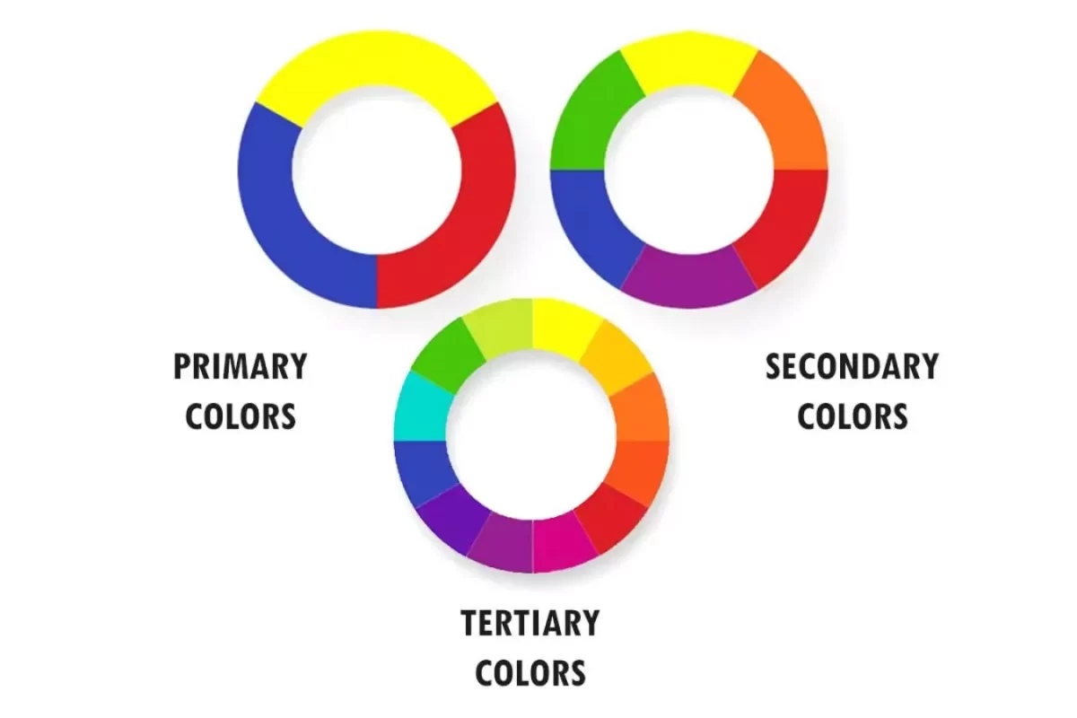
A combination of science and art, color theory describes how humans perceive and use color. It is not only an aesthetic idea. The focus is on the power of color and the methods we use to accurately capture it. Colors are systematically arranged on a color wheel into primary, secondary, and tertiary groups, rather than being randomly combined. Entrepreneurs must recognize that color theory is not just concerned with aesthetics, but rather a strategic instrument that may impact company identification and enhance sales.
Exploring Color Models
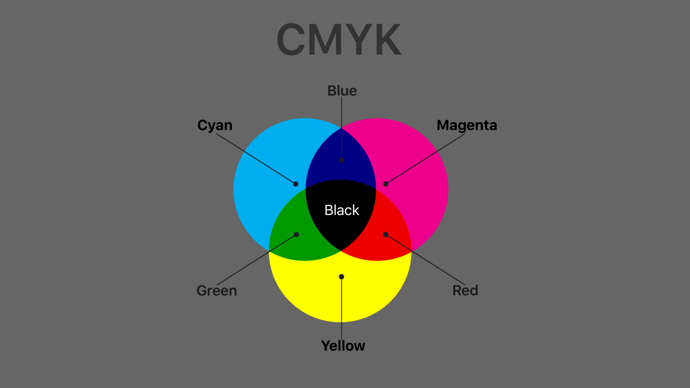
Regarding color models, our main focus is on RGB and CMYK. The RGB model is an additive model that combines red, green, and blue light at different levels to come up with an extensive palette of colors. This approach is essential in digital displays. On the other hand, printing uses the subtractive model CMYK. Superimposing cyan, magenta, yellow, and black inks selectively absorbs light, creating various colors on paper.

Demystifying the Color Wheel
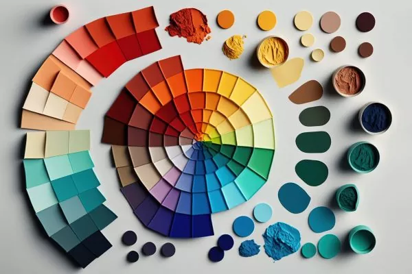
The color wheel is a fascinating visual tool that showcases the relationships between colors. Imagine a circle where hues are arranged by their wavelengths. This setup helps us understand how primary colors like red, yellow, and blue combine to form secondary colors (orange, green, purple) and further blend into an array of tertiary colors. Traditional color wheels use the RYB model, which is instrumental in teaching basic color mixing.
Understanding Color Properties
When we speak of hue, we’re referring to pure colors on the color wheel. But the magic happens when we start creating variations called tints, shades, and tones. Adding white to a hue gives you a tint; adding black gives you a shade; and mixing in gray? That gives you a tone. Each variation can transform a design’s impact and mood.

Perception and Context in Color
Perception plays a massive role in color theory. Our eyes see an object, and our brain interprets that as color based on how the object reflects light. This perception is why a consumer’s choice can be 90% influenced by color alone. Context also matters hugely. The natural light direction in a room can dramatically alter how a color appears, affecting everything from interior design to artwork.
Creating and Using Color Schemes
Color schemes are vital in design, allowing for harmony or contrast. Whether you go monochromatic with varying tones of the same color, or choose a triadic scheme with three evenly spaced colors on the wheel, each choice sets a different mood and visual rhythm. Think about the emotional response you want to evoke—whether it’s energetic, soothing, or something else entirely. Nature, with its inherent color harmony, can be an excellent source for inspiration.
Implementing Color Palettes
Choosing the right color palette is crucial. Sometimes, starting with a palette generator can spark creativity. Keep best practices in mind like the 60-30-10 rule, which is a classic interior design principle that helps balance color usage. Experimenting within these frameworks can lead to stunning and effective designs.
The Cultural and Emotional Impacts of Color
Colors are not only seen visually, but also evoke a tactile sensation. Varying hues may elicit distinct emotional responses and convey a range of cultural significance. For example, the color white may symbolize purity in some cultures, yet in others, it is worn as a sign of sadness. Comprehending these subtle distinctions is crucial, particularly in a worldwide marketplace where color interpretation might differ significantly.
Gaining a deep understanding of color means looking past the basics to explore its emotional and cultural effects. If you’re into design, marketing, or just love colors, rethinking your color knowledge could unlock new creative heights.
Unlocking Artistic Potential
If you have ever experienced apprehension regarding color blending or selecting appropriate hues for a painting, paint by numbers kits serve as an ideal entry point into the realm of art. These kits simplify the painting process for beginners by dividing intricate designs into easily understandable sections, each labeled with a number that corresponds to a specific color. Prior experience in color theory or art techniques is not necessary as the kit provides guidance at every step.
The remarkable aspect of paint by numbers is the wide range of options that are available. If you are attracted to peaceful scenery like a Waterfall River, lively Abstract art, or even portraits of well-known individuals, there is a kit available that caters specifically to your interests. Each set includes all the necessary materials, such as Canvases for Painting, and brushes, providing a convenient and effortless way to start painting. The activity is a calming and almost contemplative procedure that results in a remarkable artwork and a sense of accomplishment, as one can proudly say, “I created this!” Therefore, why not acquire a kit and explore the path that those numbers guide you towards? It is akin to filling in the designated areas with colors, but in this case, you are generating a work of art.

