News
Color Theory in Practice: A Foundation for Artistic Growth
Colors really shape how we see the world around us. Did you know that the human eye can pick up around a million different color shades? Whether we categorize these colors based on their mixing or the emotions they evoke, it’s fascinating. This blog looks at the different ways we can classify colors, diving into the interesting mix of science and art that is color theory.
Classifying Colors by Mixing Order
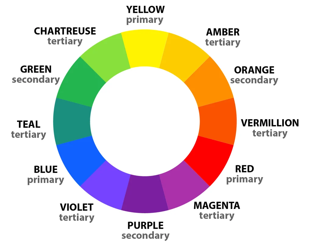
The most traditional method of classifying colors involves exploring the color wheel, where colors are organized by their order of appearance. This system categorizes colors into three main types:
- Primary Colors: This foundational color cannot be mixed with others. In color theory, the primary colors are blue, red, and green. These colors play a crucial role as they combine to produce all other hues.
- Secondary Colors: Mixing two primary colors in equal proportions results in these colors. The secondary colors are cyan, magenta, and yellow, each representing a combination of two primaries.
- Tertiary Colors: These colors result from the mixture of a primary color with a secondary color adjacent to it on the color wheel, blending the characteristics of each.
Classifying Colors by Brightness
Colors can also be classified based on their brightness, which depends on their ability to reflect or absorb light:
- Light Colors: These colors bounce back more light than they take in, which is why they look luminous and lively. On the color wheel, you’ll find these colors ranging from light orange to bright greens.
- Dark Colors: On the flip side, dark colors take in more light than they bounce back. People commonly use these colors to add depth, create contrast, or convey a more serious vibe.
Classifying Colors by Temperature
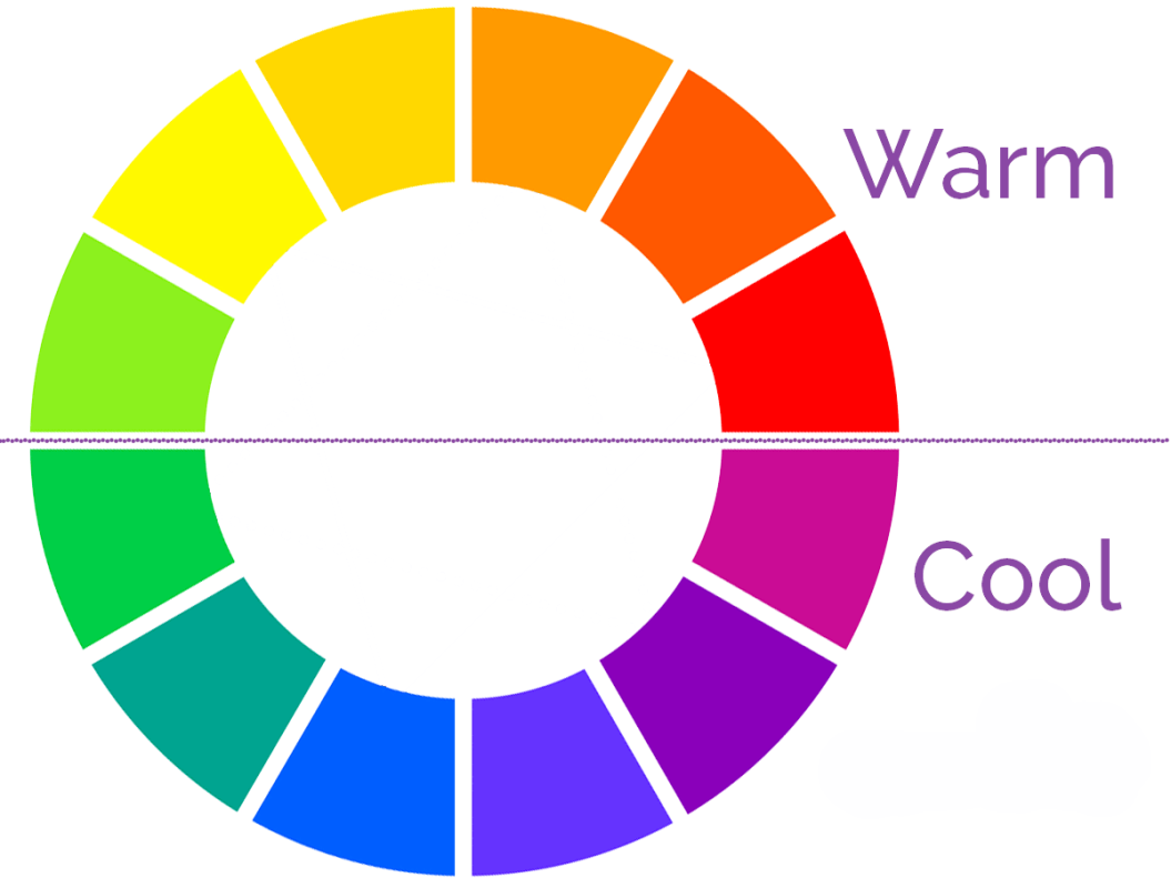
Temperature in color refers to the warmth or coolness conveyed by specific hues, influenced largely by color psychology:
- Cool Colors: Cool colors such as purple, blue, and cyan typically evoke thoughts of cooler temperatures. They often give off a vibe of calmness and serenity.
- Warm Colors: Red, yellow, and orange are warm colors often linked to the warmth of the sun or fire, evoking feelings of warmth and excitement.
Classifying Colors by Family
In professional settings such as painting, design, and interior decorating, colors are often grouped into families based on their saturation and brightness in the HSB (Hue, Saturation, Brightness) color model:
- Pastel Colors: These are soft hues with low saturation and high brightness, known for their soothing properties. Examples include salmon pink, soft mint, and lavender.
- Earthy Colors: These hues draw from nature and include not only the browns and greens but also sky blues and muddy oranges.
- Neutral Colors: So, when you look at the grayscale, you’ll see colors that range from black, through various shades of gray, and culminate in white. They’re really versatile and give off a feeling of balance.
- Neon Colors: Characterized by their vibrancy and high saturation, neon colors are energetic and attention-grabbing.
Understanding Color Perception
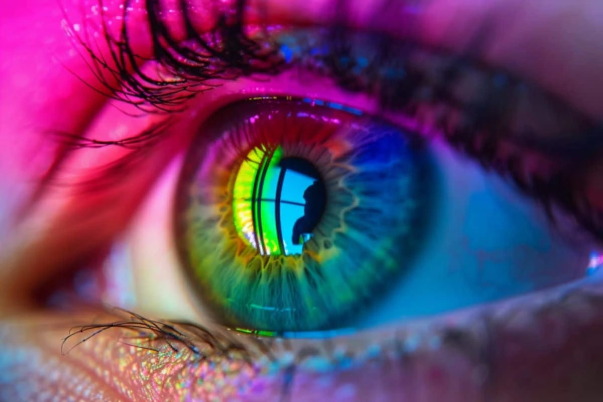
Color perception begins when light reaches the retina in our eyes, which contains special cells called cones. These cones capture red, green, and blue light and transform it into signals. The brain picks up those signals and transforms them into distinct colors. Due to individual physiological differences, these cones function in a way that allows people to perceive colors uniquely.
Things like lighting and the angle we’re viewing from, along with cultural and psychological influences, can significantly alter our perception of color. Color is such a personal thing, influenced by so many different factors. It really highlights how intricate the connection is between what we perceive and the world around us.
The Importance of Color Combination
Mixing colors the right way is vital in lots of areas, like interior design, digital media, and art. Mixing colors really boosts the look of spaces and visual projects, and it can also affect how we feel and act.
Also, colors can really stir up certain feelings and even influence how we make decisions. When designers and artists get the hang of color harmonization, they can really boost the impact and effectiveness of their work. This way, their creations can clearly communicate the message they want and stir up the emotions they aim for.
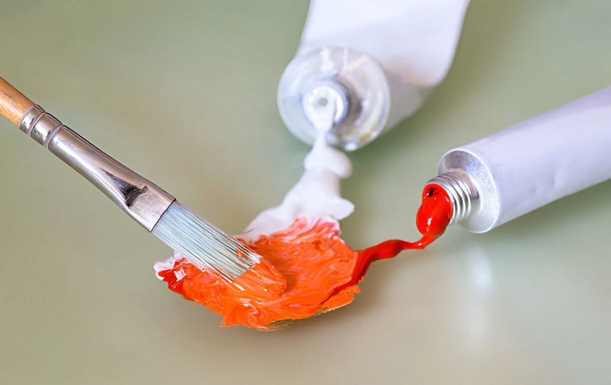
Practical Application: Painting Without Prior Experience
Even without extensive knowledge of color theory, anyone can create art thanks to innovative methods like paint by numbers. Modern Paint by Numbers offers kits that simplify the painting process, allowing individuals to focus on the enjoyment of creation. Each colorful kit includes a pre-numbered canvas and matching paints, guiding novices and experienced painters alike through the process to ensure a beautiful result.
Why not tap into your inner artist with one of our colorful paint-by-number kits? It’s a relaxing way to get creative! Our Monet’s Garden at Giverny kit allows you to capture the charm of Giverny on your canvas, if the vibrant colors of Impressionism captivate you. If you’re into the bold and bright vibes of modern art, our Abstract kits is perfect for you! It lets you explore dynamic shapes and vibrant color palettes. These kits are a wonderful way to dive into painting while having fun and unwinding. Plus, you’ll end up creating pieces that you’ll be excited to show off or give as gifts.
Conclusion: Unleash Your Inner Artist
Whether you’re a seasoned artist or a budding novice, understanding and applying color theory can transform your approach to art. Explore our range of Modern painting kits today and discover the joy of bringing vibrant, realistic, or abstract paintings to life. Let your creativity flow and perhaps gift a personal masterpiece that captures more than just colors, but the very essence of expression.

